We belive
in the power
of details
Creative team with passion for design

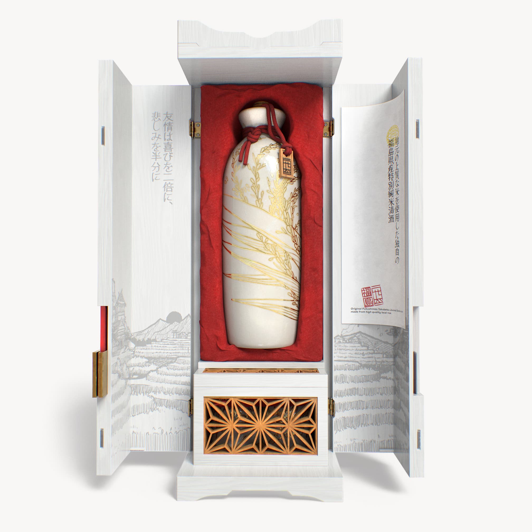


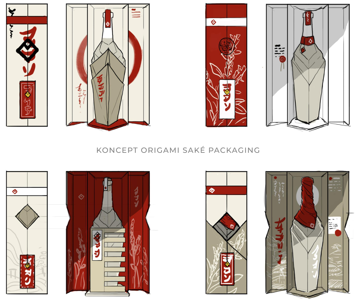
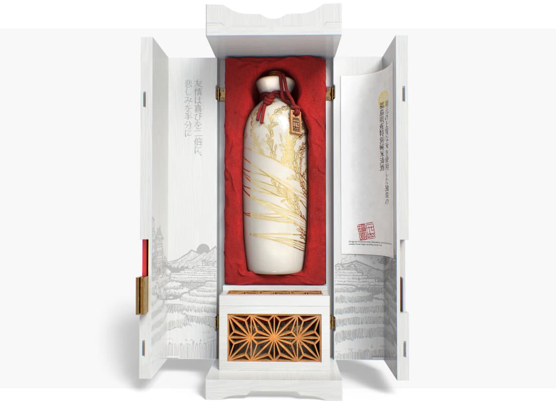
This packaging design was for a limited edition of premium Japanese saké, that combines modern and traditional elements. We designed the package itself to create a unique opening experience.
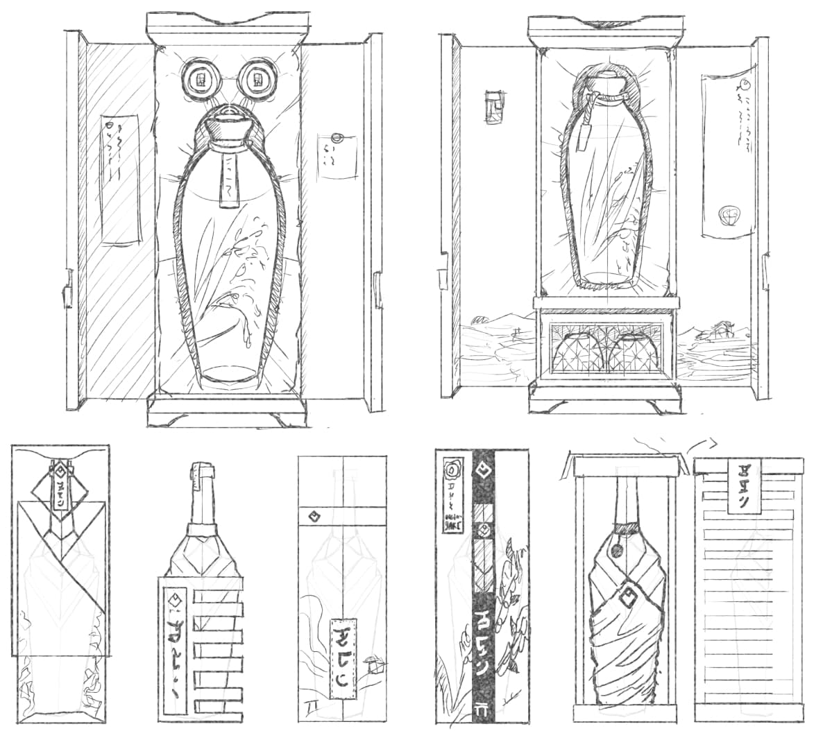
Take a look at the details of each step during the research, prototype and design phase.

RGB 141 52 50
HSL 1 48 37
#8D3432
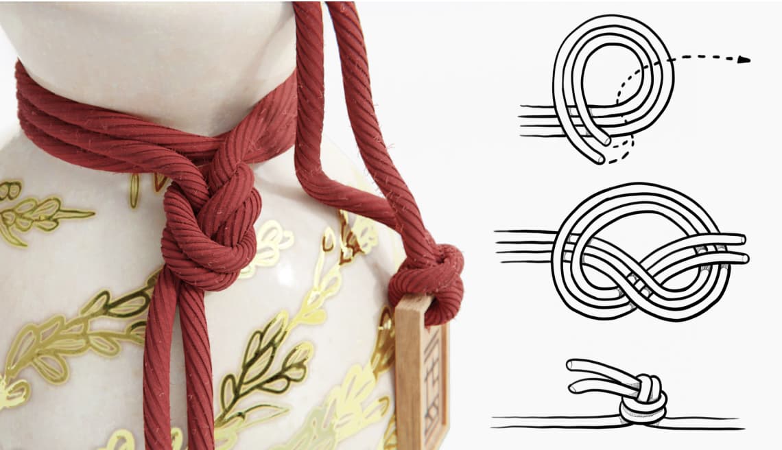
It is well known that in Japan, red is the national colour of the sun. That is why we used it as a contrast point for elements, which should catch the user's attention.
RGB 211 162 118
HSL 28 51 65
#D3A276
The colour is inspired by softwood and the traditional restoration technique "kinsugi," during which the porcelain cracks are repaired with gold. The pottery repaired in this way gets its unique story.
RGB 220 221 221
HSL 180 1 86
#DCDDDD
RGB 164 165 162
HSL 80 2 64
#A4A5A2
RGB 101 99 91
HSL 48 5 38
#65635B
RGB 193 185 164
HSL 43 19 70
#C1B9A4


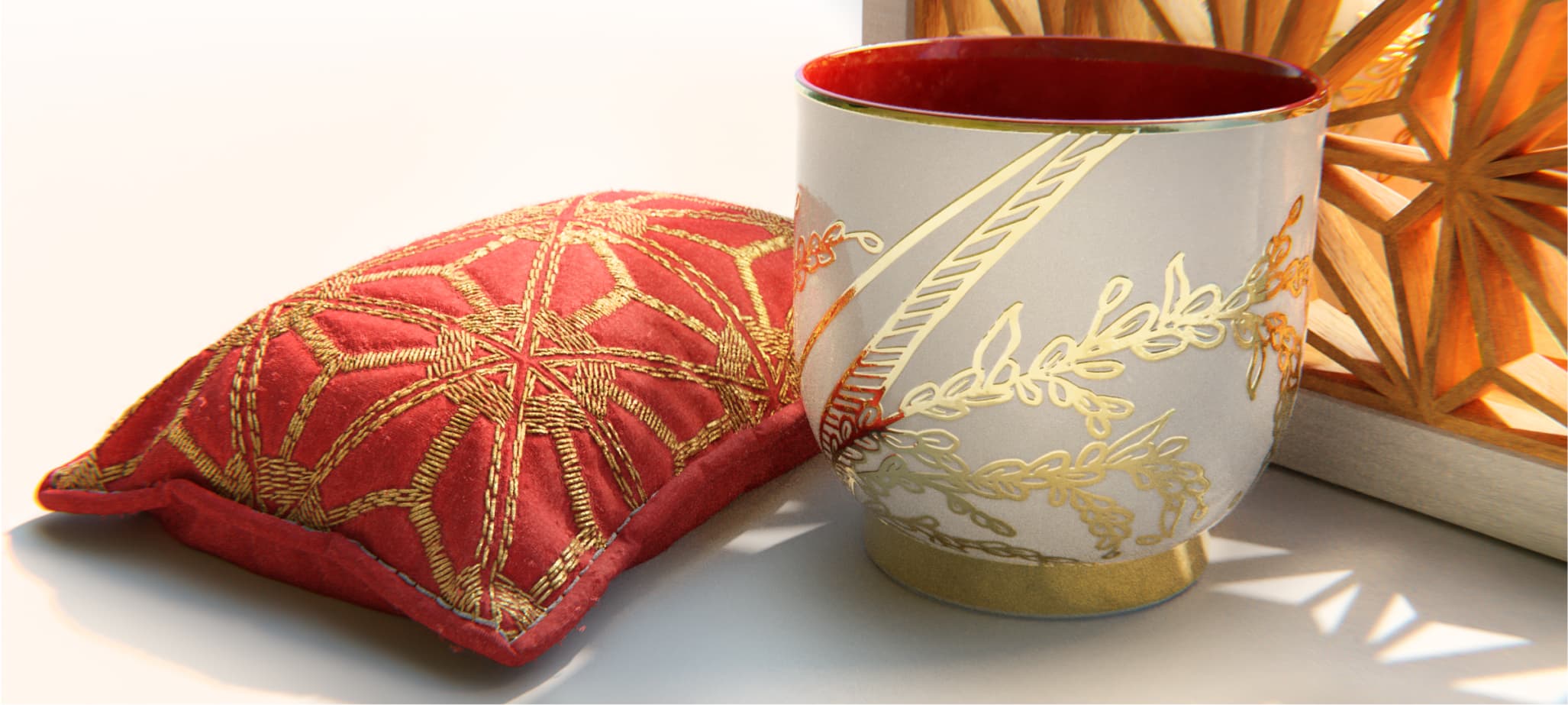
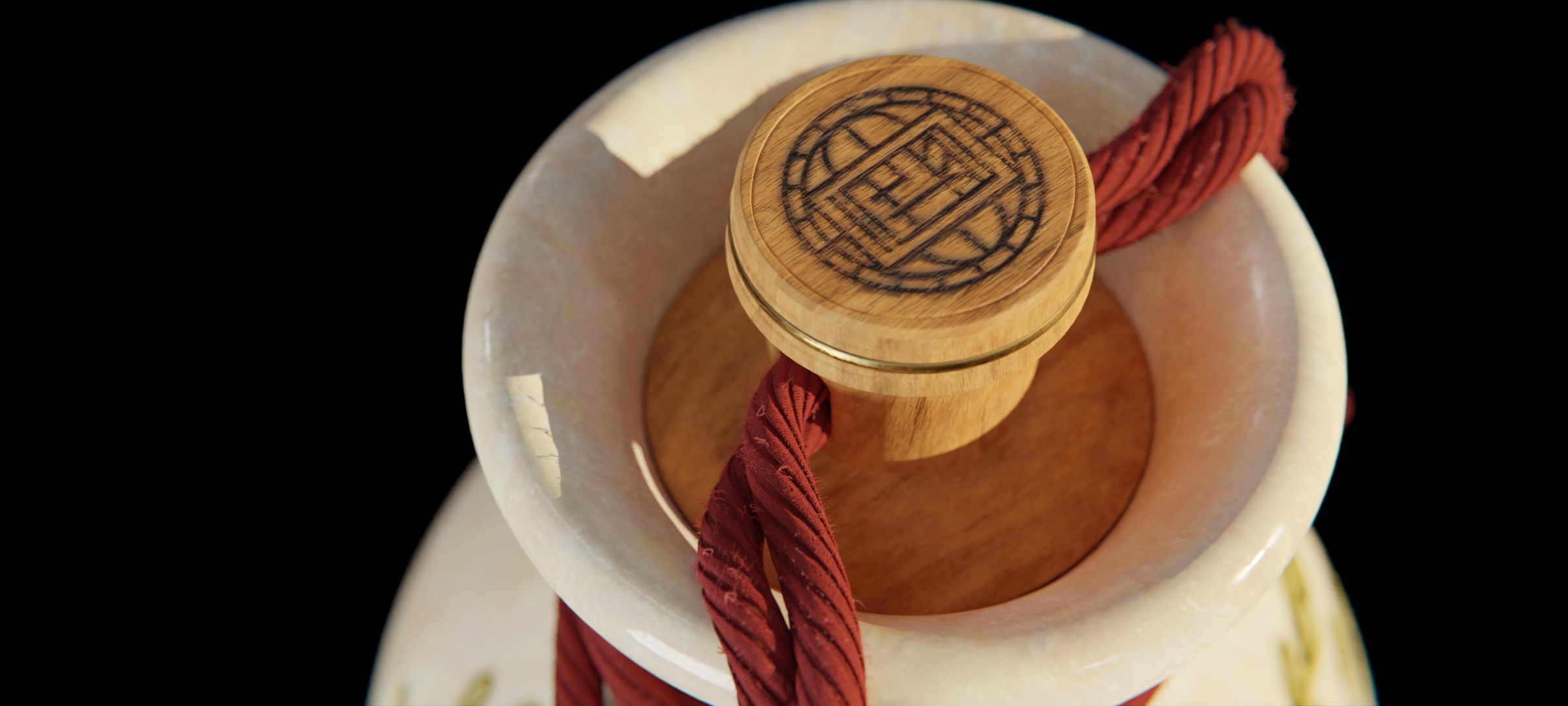
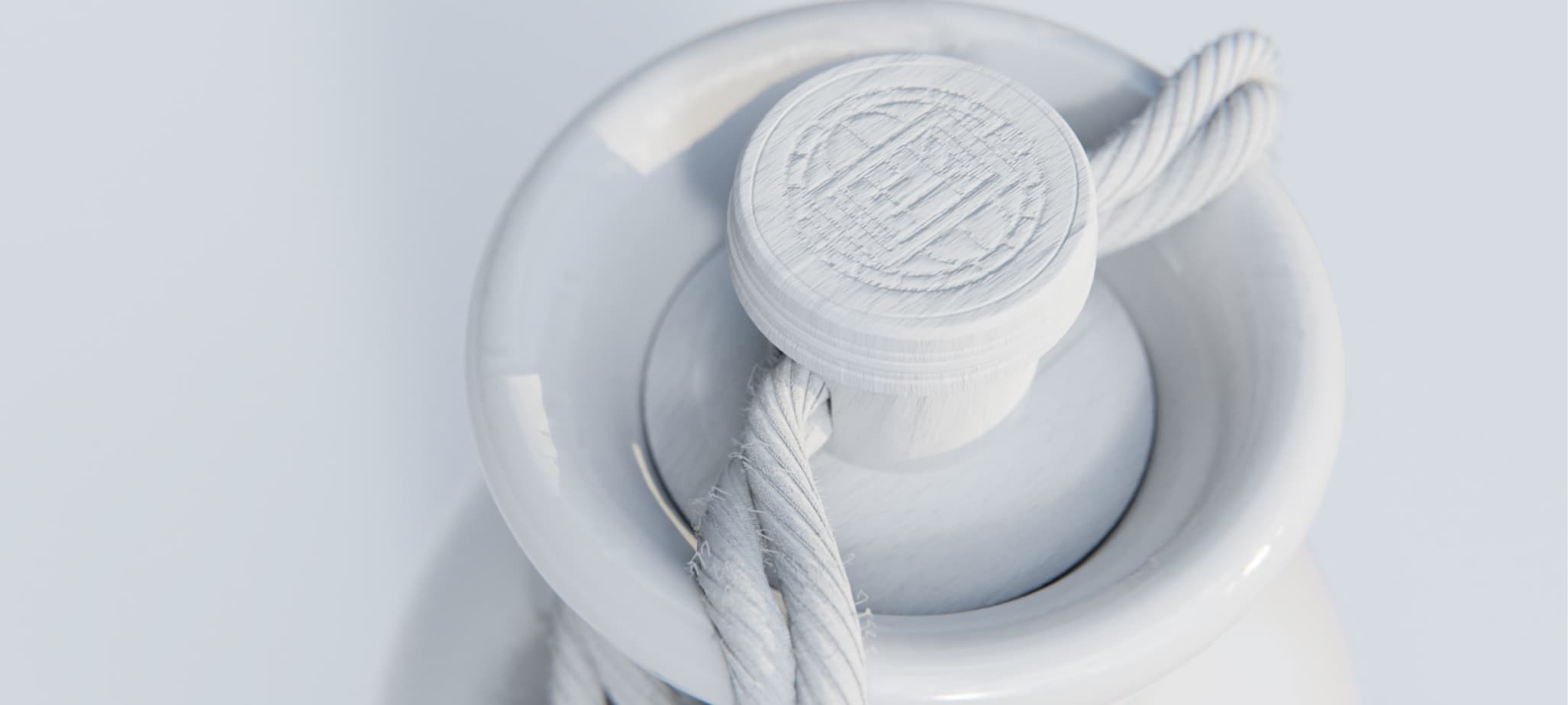

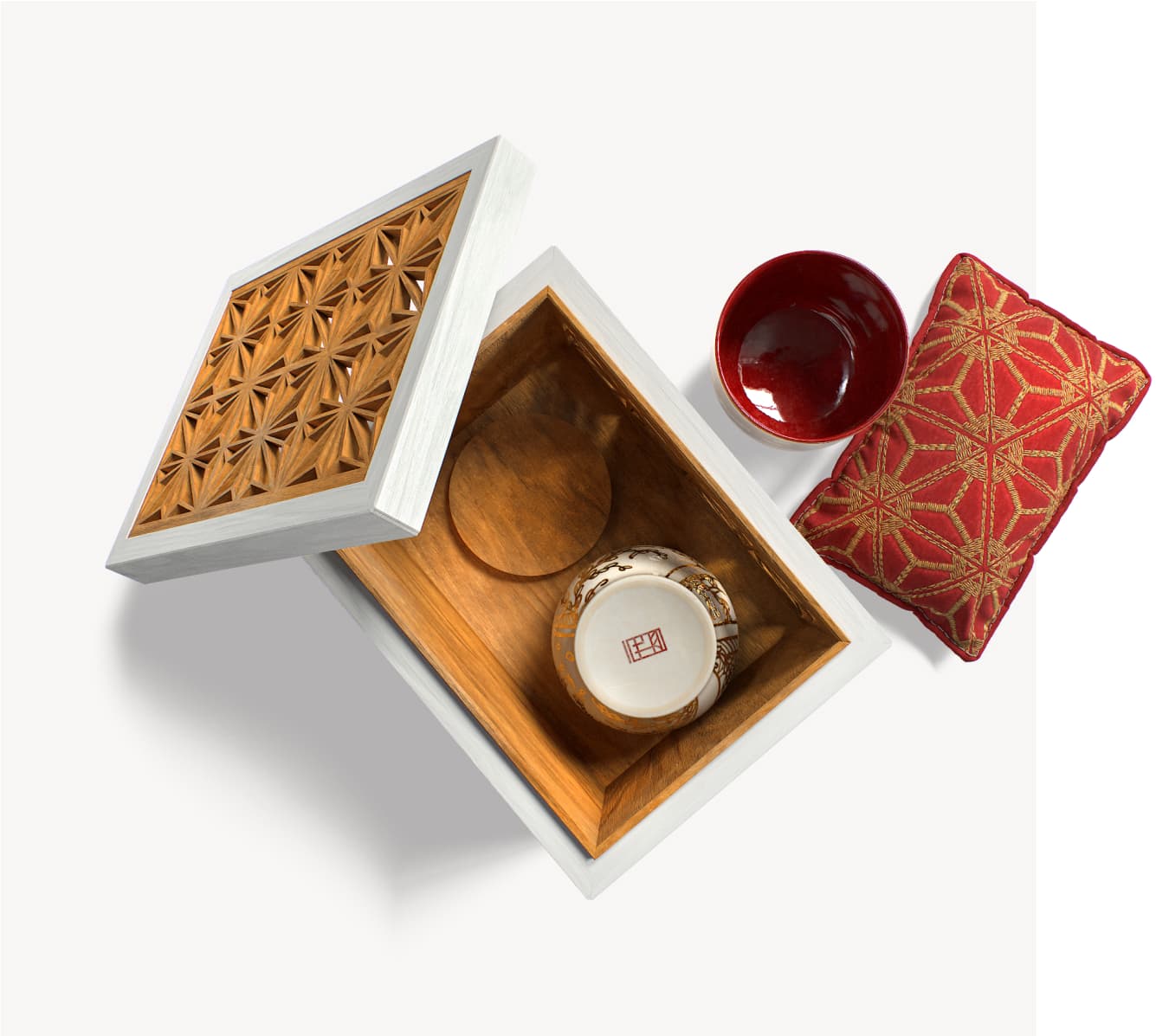
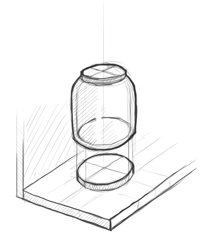
The wooden box for a set of cups contains a soft pillow. Together with the individual stands for each cup, they prevent any unwanted movement during the transport. The packaging includes a special soft filling for the safety of the ceramic bottle.
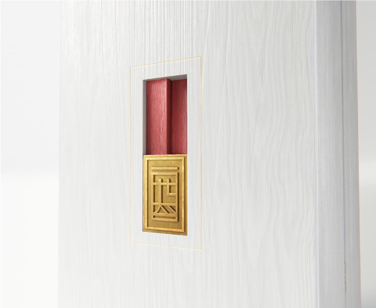

We have designed a locking mechanism, that visually fits into the thematic style, does not unnecessarily complicate the production and remains intuitive for the user. Locking is based on the principle of Japanese puzzles. The click after opening, thanks to magnets on both sides, provides a satisfying feeling.
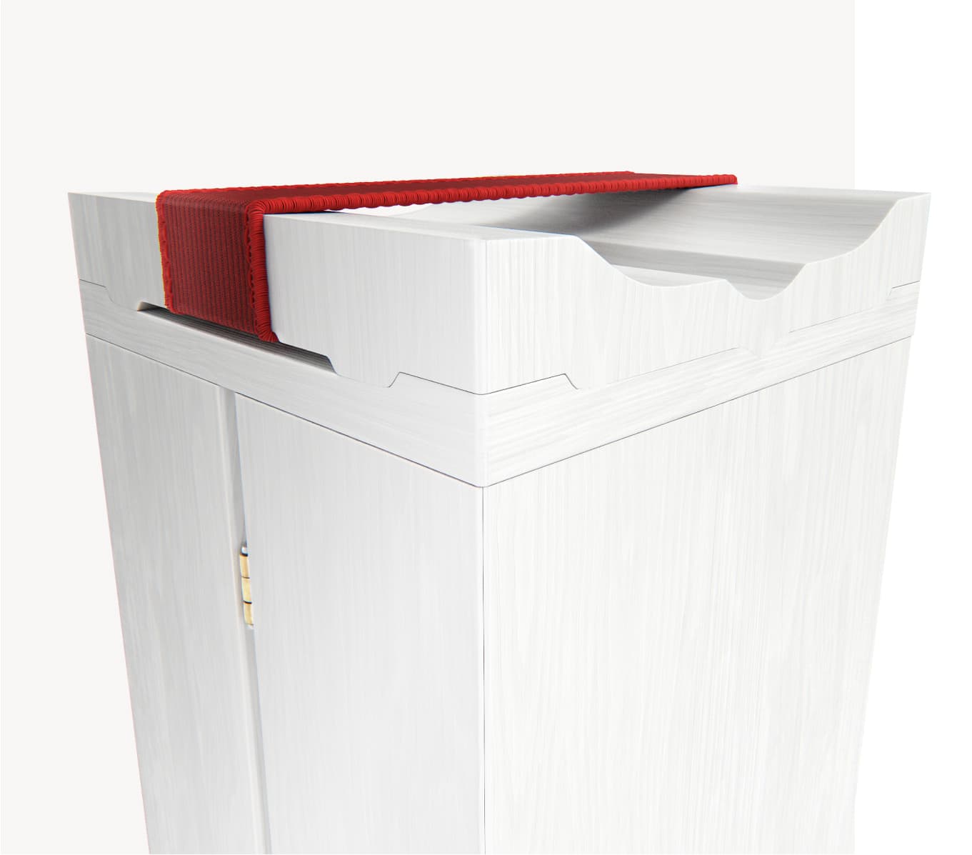

The solid construction and a square floor plan form the basis of the packaging, from which nothing sticks out. This allows more convenient transport, more efficient use of storage space, while maintaining the elegant design. We simplified the transfer, by adding the elastic fabric on the top of the package.


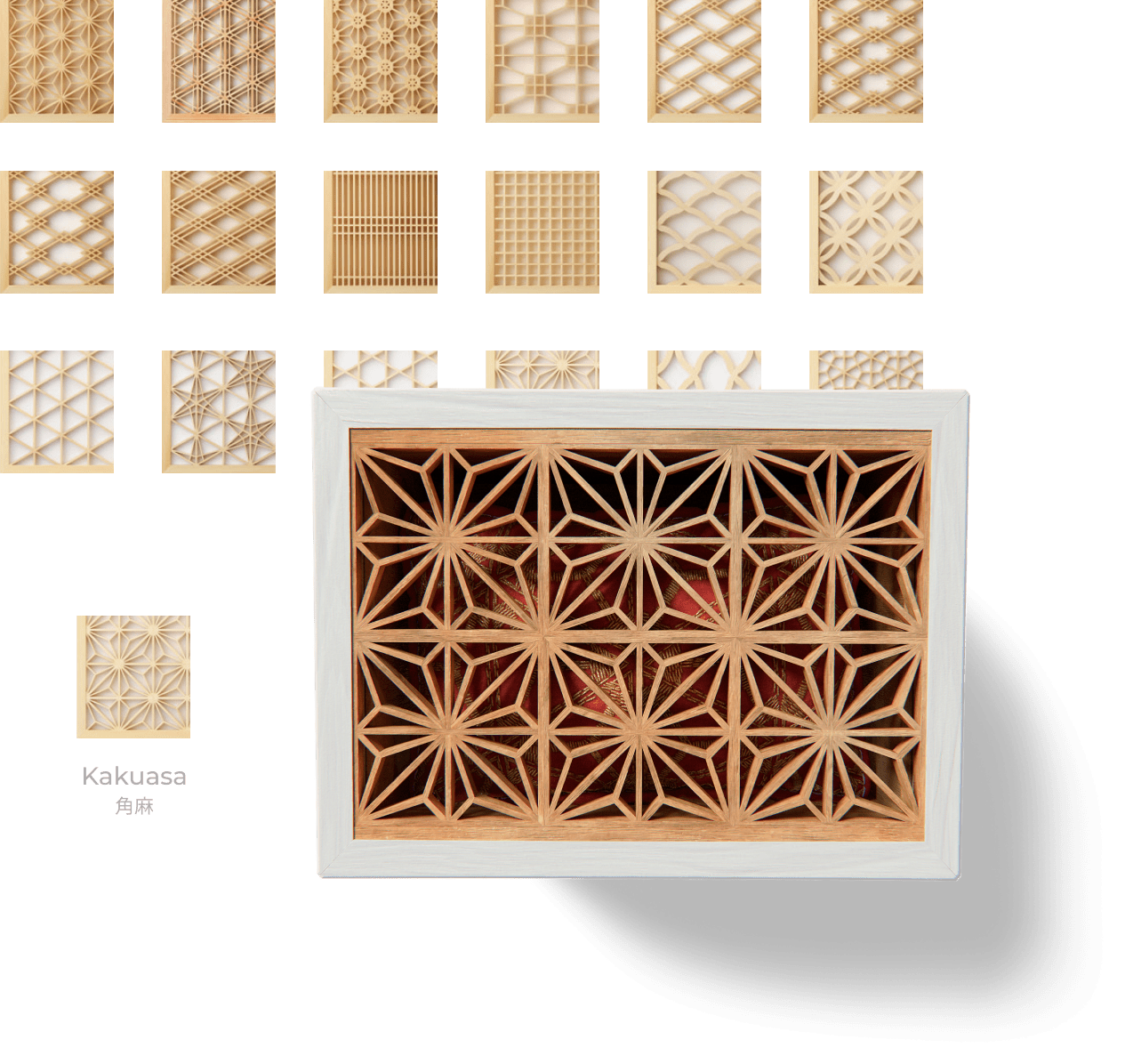
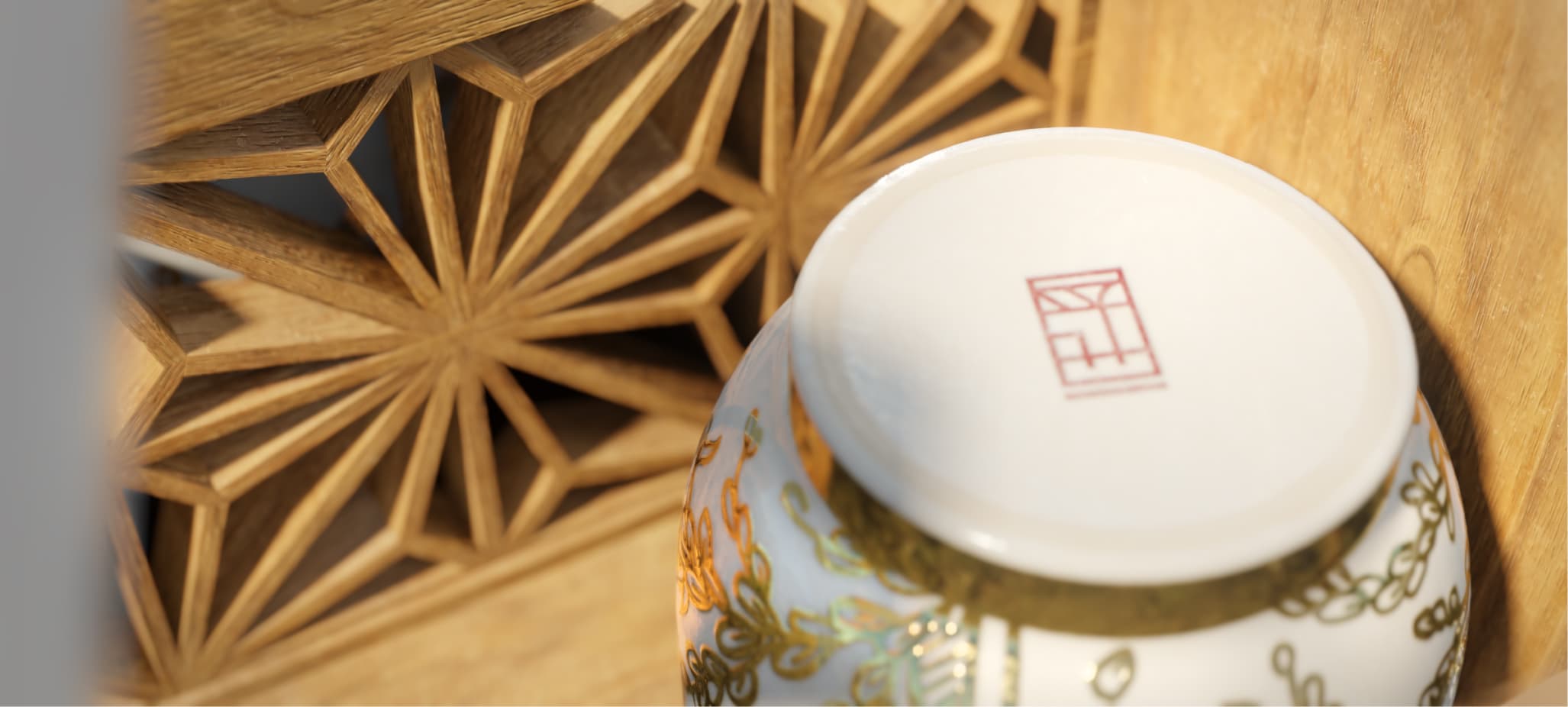
The uniqueness of the box lies in the decoration, using Japanese "kumiko" art. Precise stacking of the shredded wooden pieces, fitting together with a maximum accuracy, creates the specific patterns.
This technique requires a dose of precision and patience, so just like the art of "bonsai", it becomes a meditative activity. Therefore, it is clear why the art of "kumiko" fits into our design philosophy and tradition used in this project.
The pattern used for the box, called "kakuasa," is one of the most famous in the art of "kumiko". This pattern also includes a hemp leaf, which is a traditional Japanese design element. It is said, that folding the letter in a square brings stability of happiness, and that the sum of all triangles protects against evil.
Source