We belive
in the power
of details
Creative team with passion for design


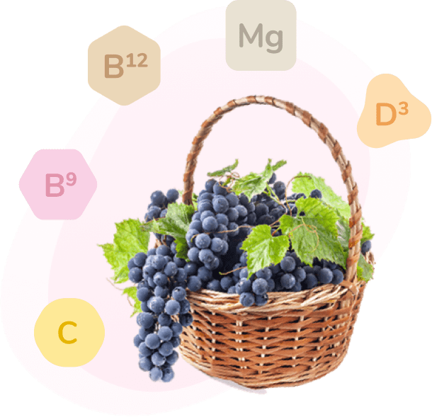
Two friends came up with a great idea. To create a revolution in supplementing the necessary nutrients for baby development without taking pills. Delicious, 100% natural juices, in three different flavours. For moms, who care about their baby's health.
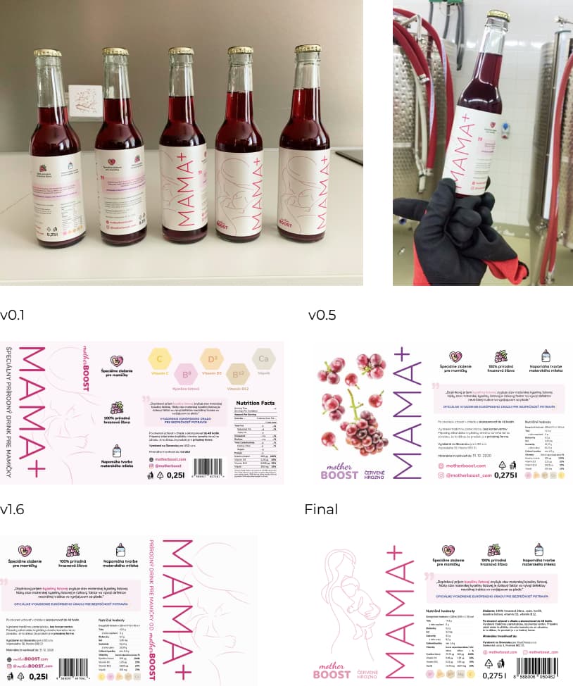
Take a look at details of each step during the research, prototype and design phase.

RGB 216 1 117
HSL 328 99 43
#D80175
Clearly communicates with the target audience, that is mothers and mothers-to-be. The colour also symbolizes love and self-esteem.
RGB 252 194 0
HSL 46 100 49
#FCC200
Fills the design with a feeling of warm sun, good mood and optimism. Also, the yellow colour in marketing has been long-term associated with vitamins.
RGB 236 128 186
HSL 328 74 71
#EC80BA
RGB 230 73 153
HSL 329 76 59
#E64999
RGB 238 155 88
HSL 27 82 64
#EE9B58
RGB 147 192 31
HSL 77 72 44
#93C01F

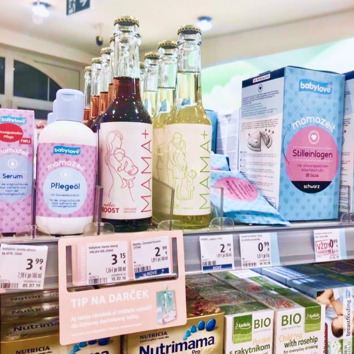
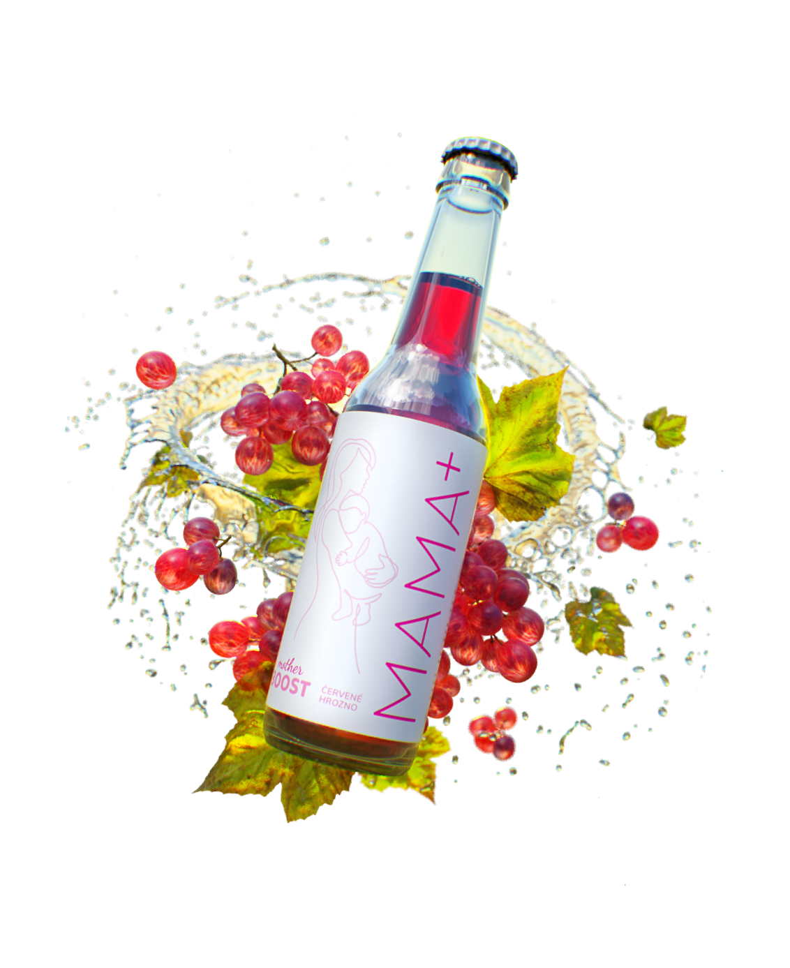
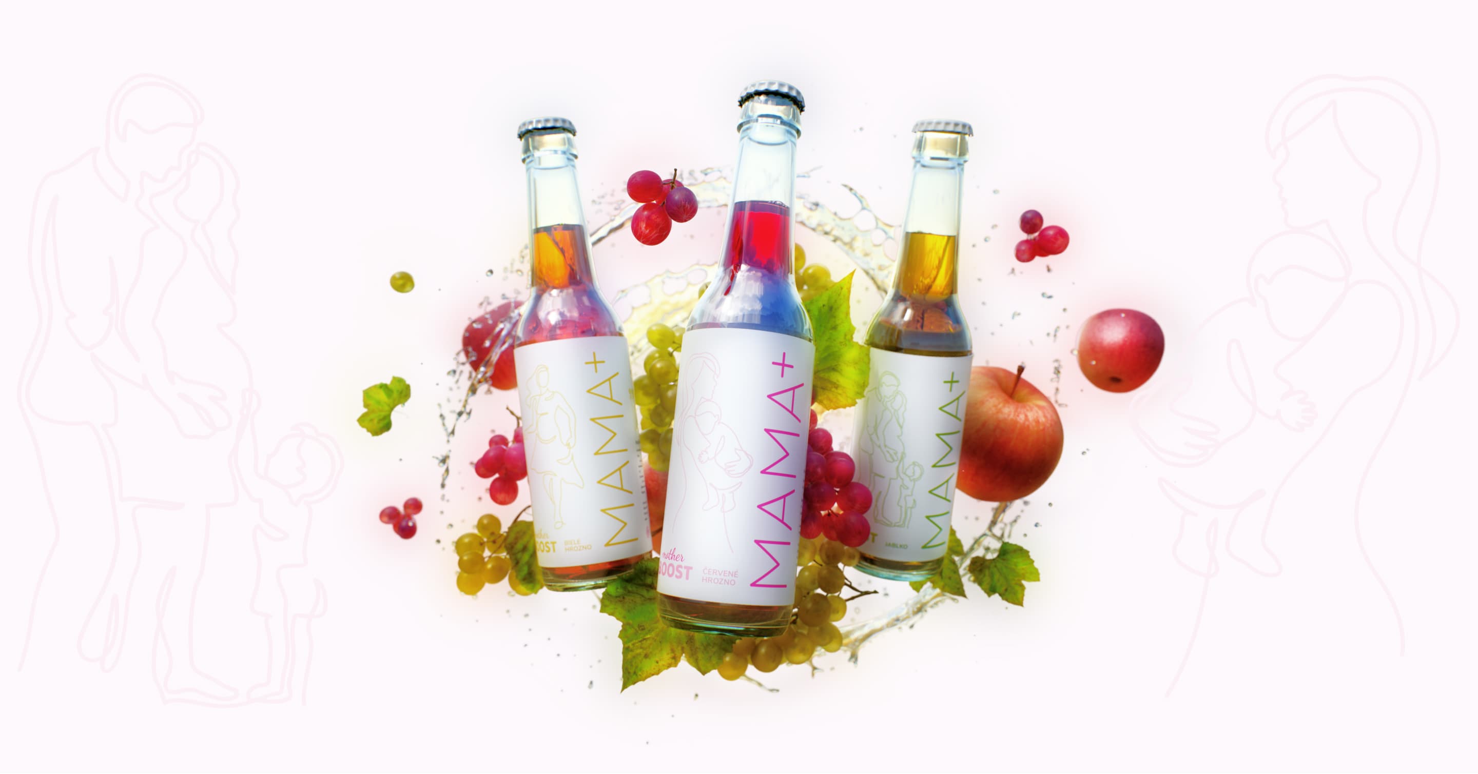
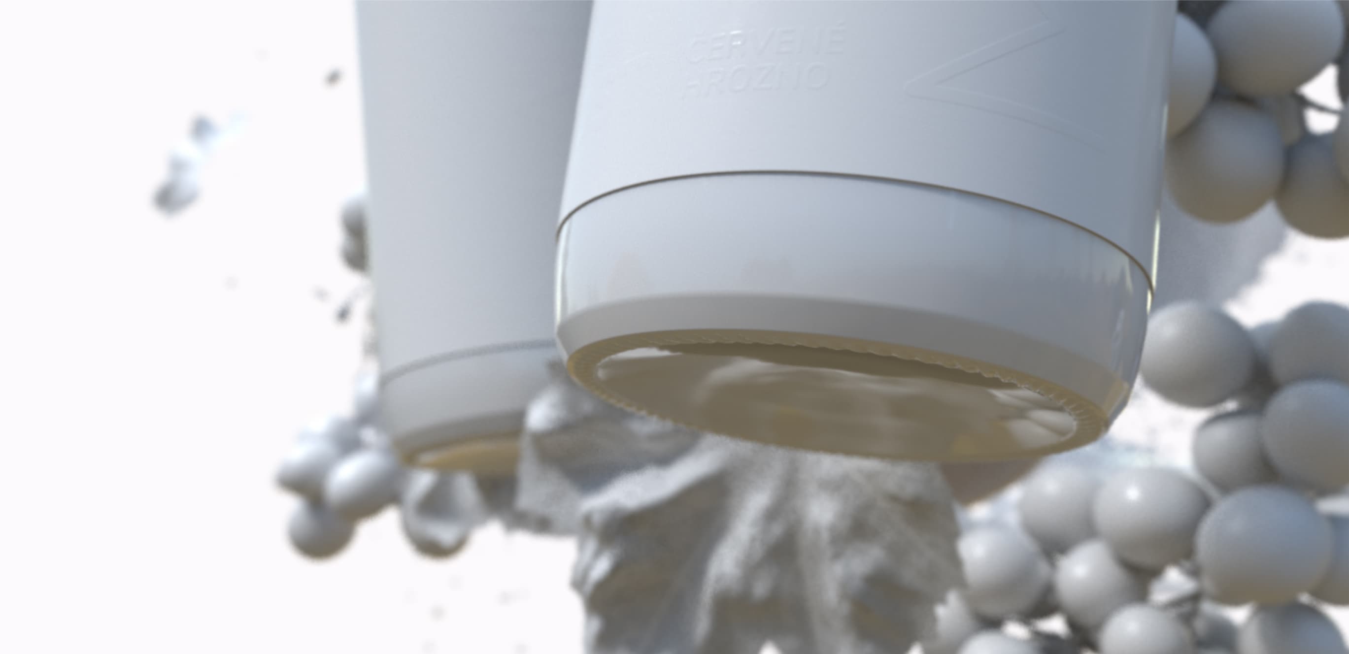
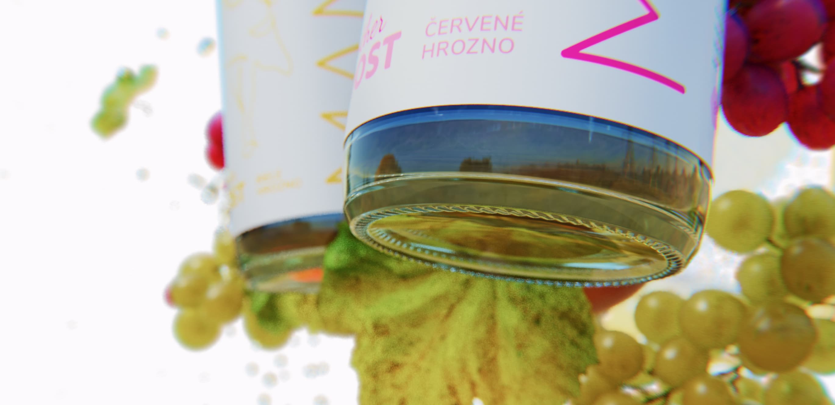
The product name MAMA+ was placed vertically to take the full advantage of the label's vertical height, in order to catch customers’ eye at drugstores and local groceries.
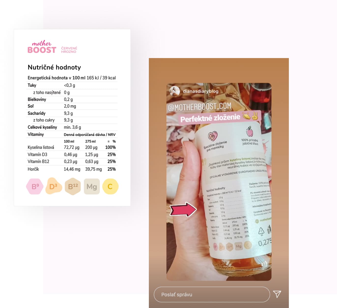
It is always necessary to mention all the required information on this type of product. We paid special attention to the size and readability of the font. After several versions of the sticker, we reached the layout of the elements, which was effective, clear, and at the same time, usable from every angle of the bottle.
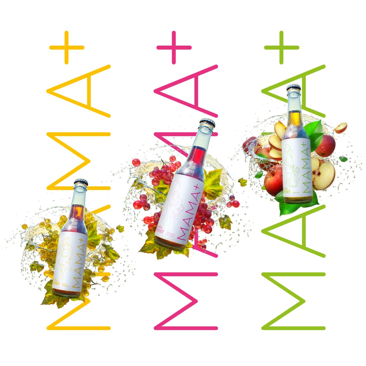
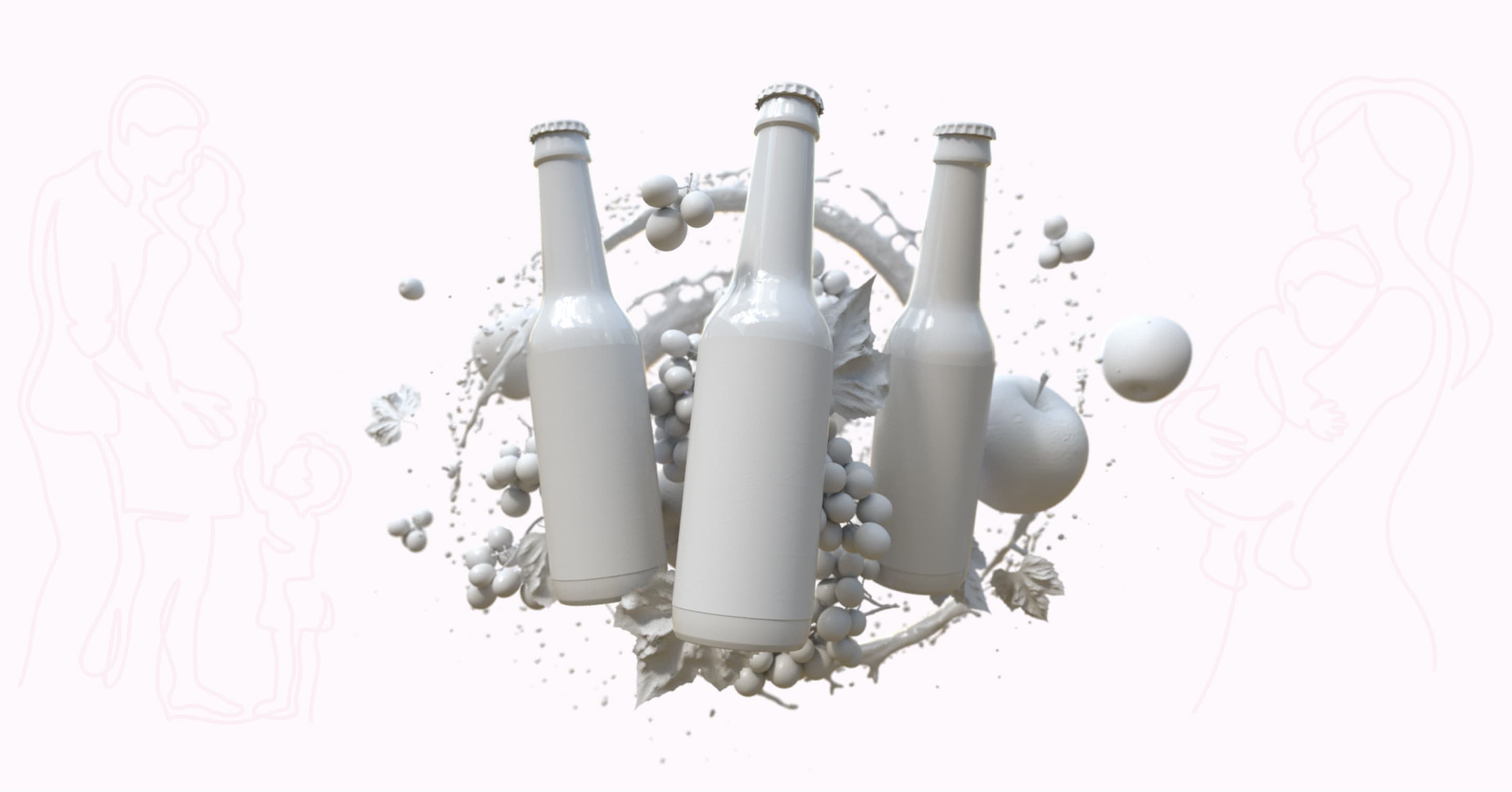
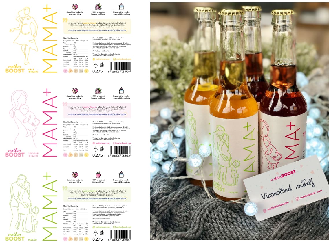
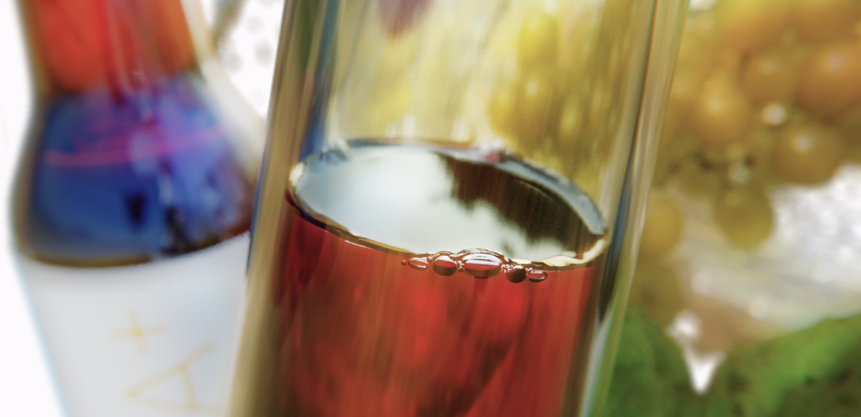
Three flavours, three characters. Apple, dark grapes and white grapes. Each flavour has its own unique colour, and each depicts parenthood using a different illustration. Vibrant and deep colours are chosen to attract attention, and so that the drink looks fresh and healthy, just like the seasonal fruit.


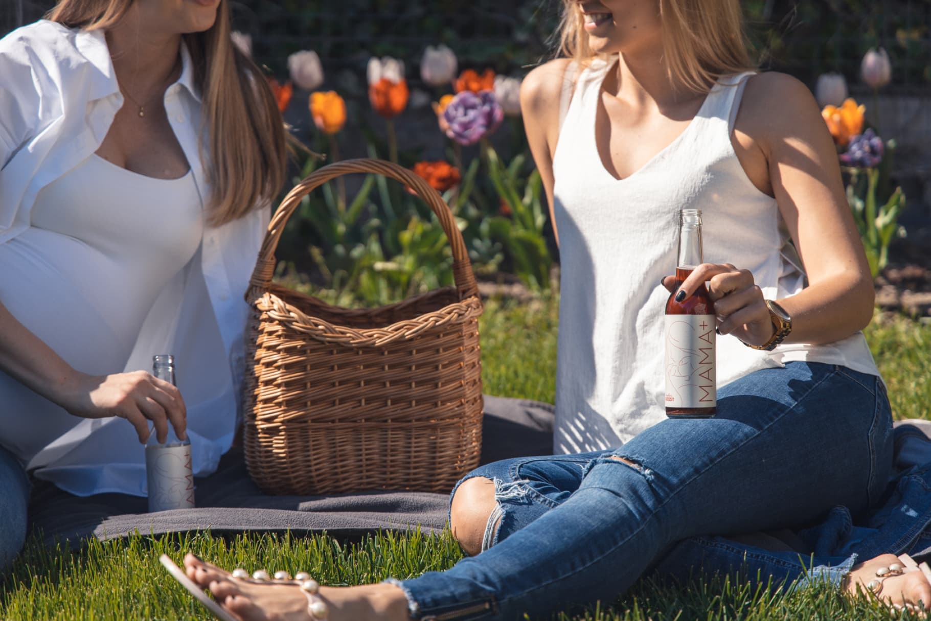
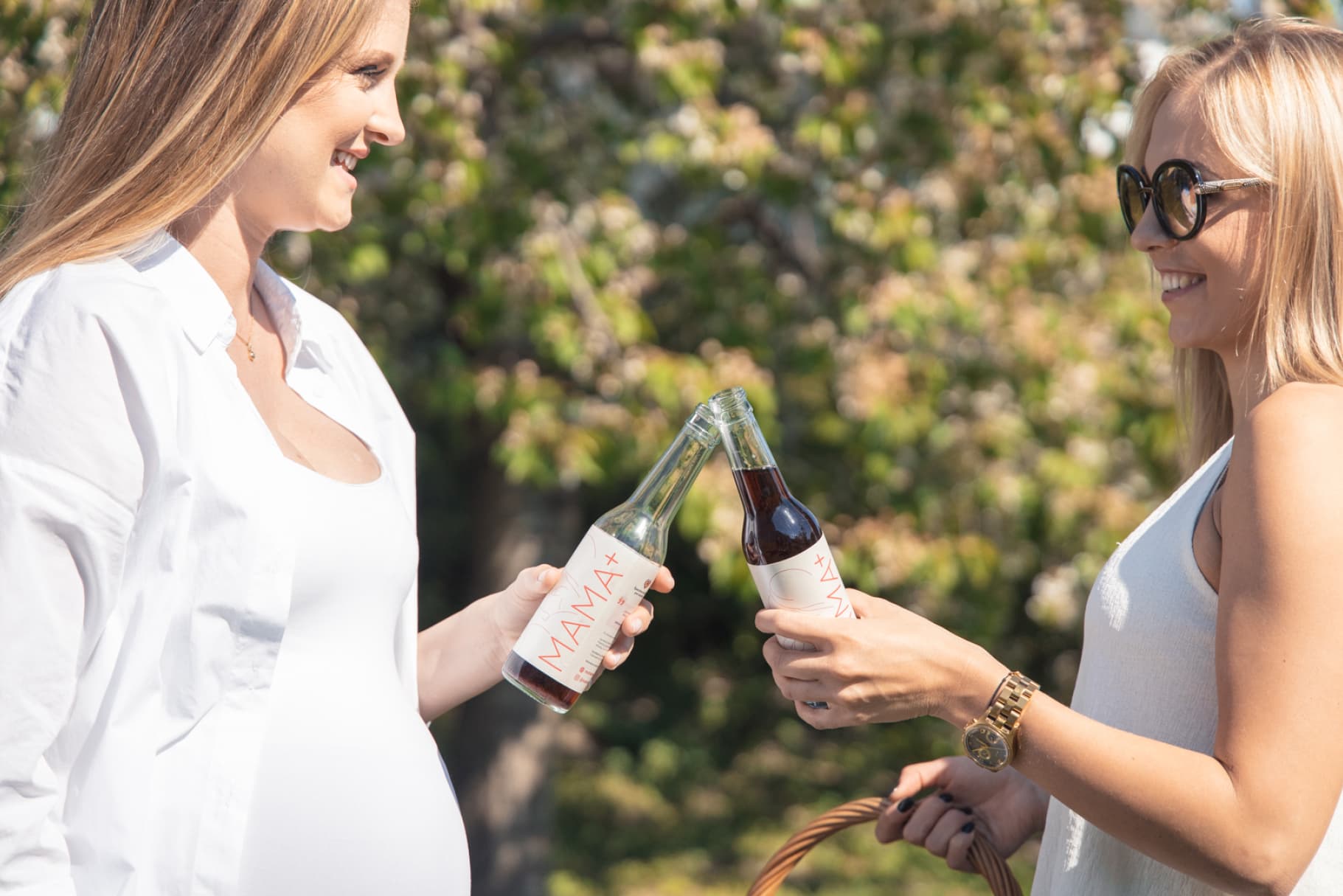
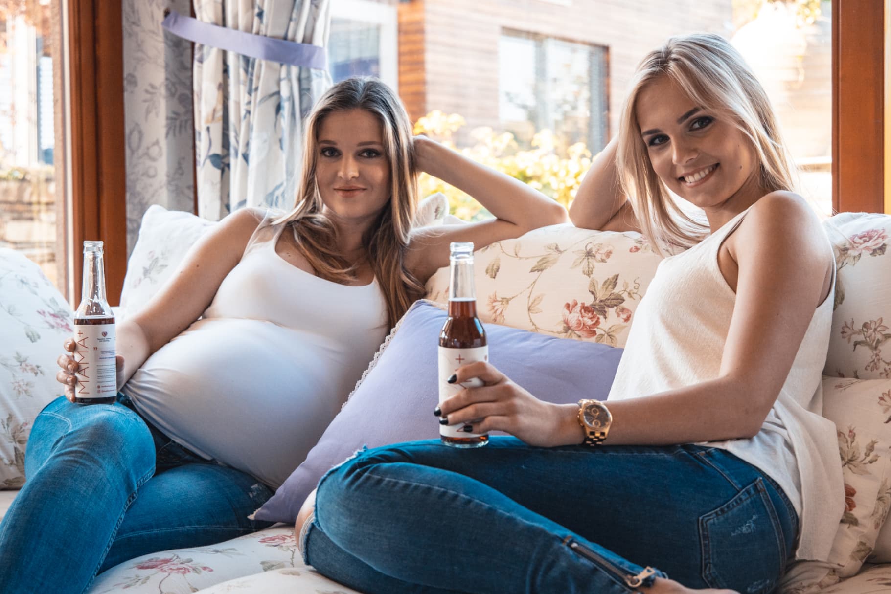
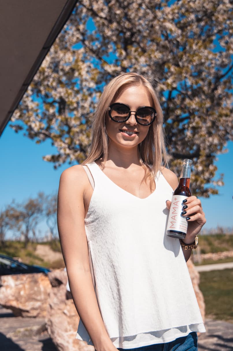
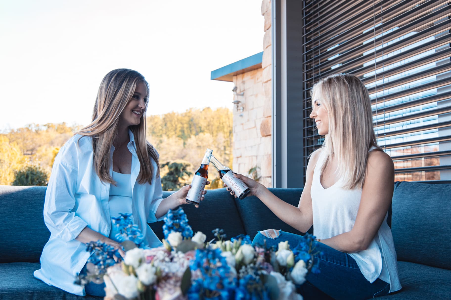
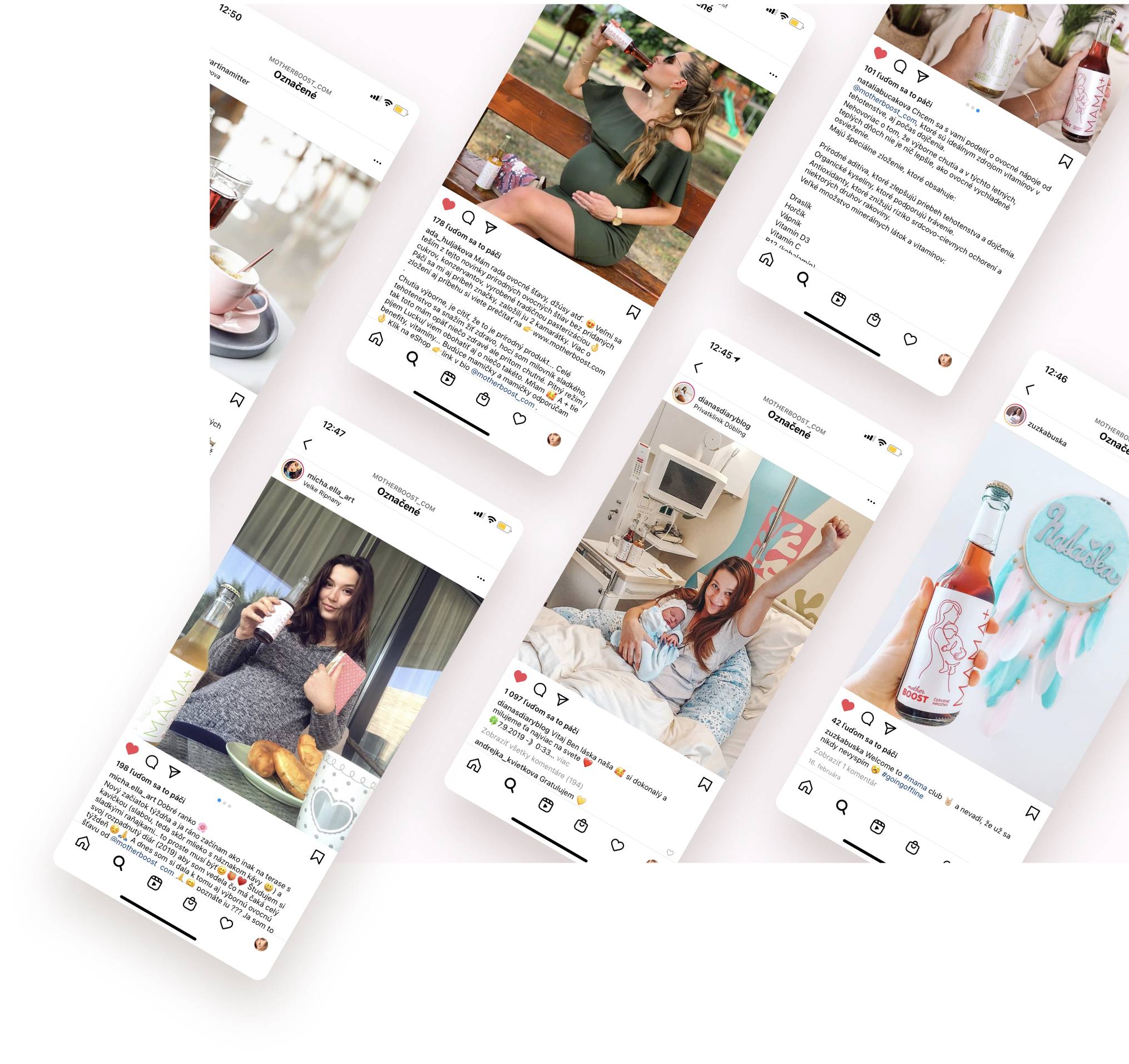
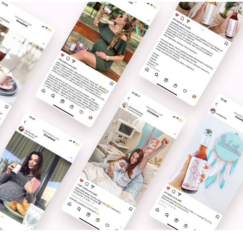
Thanks to the future mothers, enthusiastically sharing the content, we were able to create the brand and a product awareness. Moms adding photos with a drink and spreading the news about MAMA+ among their followers through social networks.
"Great job in all aspects. Studio detaility is a truly reliable and creative partner, that always exceeds the expected. The work was done to the tiniest detail and on time. Our products are loved by mothers. Thank you!"